

InPower is a consulting brand in the field of alternative therapies, focused on personalized support for people seeking to improve their emotional, mental, and spiritual well-being. The brand acts as a link between individuals and different therapeutic approaches, helping to identify and structure paths tailored to each person.
In a sector marked by information overload, multiple methodologies, and unclear discourse, it became essential to create a brand with a strong identity, its own language, and the ability to convey confidence, depth, and clarity.
Making Digital Simple was hired to develop the InPower brand, clarify its positioning, and create a visual universe consistent with its approach to well-being and personal development. To move forward with this project, we brought in a partner, the design studio Anahory & Monteiro.
The main challenge was to organize a sensitive and complex territory through a structured and legible brand. It was essential to communicate support, cross-cutting knowledge, and focus on the individual, avoiding obvious or overly spiritual visual codes, and bringing the brand closer to a symbolic, human, and timeless language.
The project included brand development and positioning, defining conceptual pillars, creating the creative concept and slogan, and developing the entire visual and graphic universe.
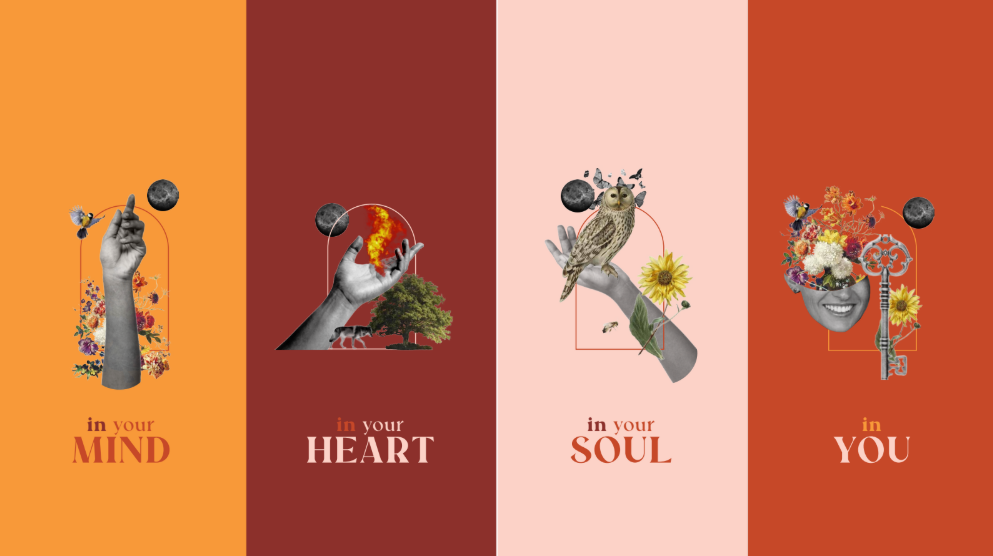
The brand was structured around three main pillars of action: mind, heart, and soul, which served as the basis for its conceptual and visual construction.
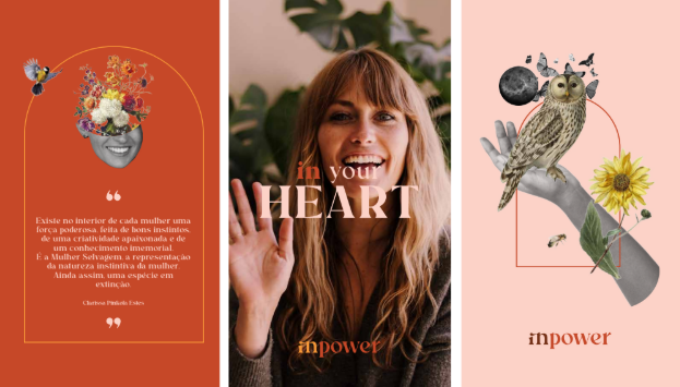
The visual universe of InPower is based on a symbolic collage language, where human, natural, and cosmic elements coexist to represent different dimensions of well-being.
The mind is associated with thought, consciousness, and inner expansion, through symbols linked to questioning, introspection, and movement.
The heart is linked to emotional energy, instinct, connection to nature, and life force.
The soul manifests itself in the connection between all elements, in the idea of inner journey and integration, represented by structures that function as portals and points of passage.
This system allows profound concepts to be communicated intuitively, creating an immediate emotional response that is consistent with the essence of the brand.
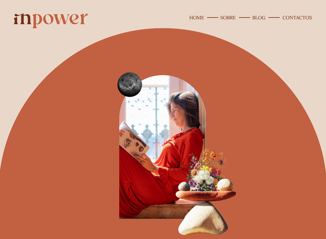
InPower's identity was designed as a modular and flexible graphic system. The visual elements can be used individually or in combination, allowing for the creation of diverse visual narratives without losing consistency.
Color plays a fundamental role in brand communication. A color palette was developed to represent the different pillars and areas of activity. Terracotta refers to justice and emotional connection, brown to education and evolution, nude to mind and soul, mustard to heart and body, and green acts as a cross-cutting element, representing the integration of the pillars and the brand's holistic vision.
This color system helps organize communication and reinforce meaning, ensuring a recognizable and adaptable visual identity.
The result was a strong, conceptual, and consistent brand, with its own visual universe capable of sustaining its communication over time. InPower now has a clear, sensitive, and structured identity, aligned with the depth of its work and prepared to grow in a demanding and emotionally complex territory.
